1.
Three moving image screens on one side hanging on the wall with nothing above or bellow them, spaced evenly and at eye level on the wall. Four square prints, all large sizes (A1 square) spaced evenly apart.
2.
Moving image triptych, image triptych, image diptych. No feature of Flo, just Rowan, Jack, me.
3.
Moving image triptych, image triptych, image diptych. No feature of Flo, just Rowan, Jack, me.
4.
Moving image bellow larger self portrait. Singular images, Flo features, and triptych of Rowan, Jack and me.
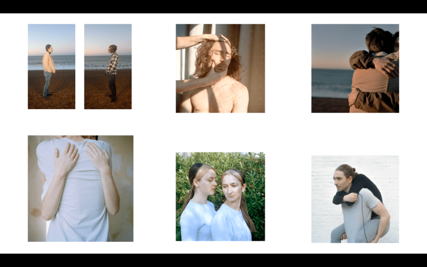
For the following images, I have decided to swap my moving image from the darker to the lighter of Jack and Rowan in separated frames. My reason for this is because while I think the moving image with the darker setting is strong, it is too dark to work with the rest of my work. I have shot a lot in natural light, or made sure my settings are light. I have therefore substituted it with the tonally lighter moving image pieces. These are also the moving image where Rowan and Jack are in separated frames, which, depending on the end layout result, could enhance the theme of loneliness, separation and disconnect.
5.
Moving image bellow large print of me hugging Rowan. Four large individual photographs spaced evenly apart.
6.
Moving image above large singular image. One triptych and one diptych.
7.
Moving image above large print of my and Flo, two smaller singular images. One triptych of Rowan, Jack and me.
8.
Moving image above large print of me hugging Rowan, four smaller singular images.
9. (Same as 8 apart from moving image).
The same as above, but the moving image will show both the one above and this one, switching between the two and showing the four different pieces on a loop.
10.
Moving image above large print of me hugging rowan, four smaller singular images to the left.
11. (Same as 10 apart from moving image).
The same as above, but the moving image will show both the one above and this one, switching between the two and showing the four different pieces on a loop.
12.
Same as above but lower right corner image change, so that there is one image of each of our faces, me, Flo, Rowan and Jack.
13.
Moving image above a triptych of me, Rowan and Jack, four larger images on the right.
14 (Same as 13 apart from moving image).
The same as above, but the moving image will show both the one above and this one, switching between the two and showing the four different pieces on a loop.
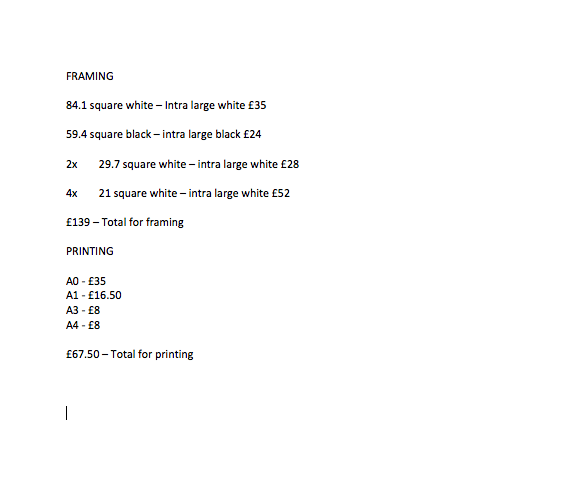
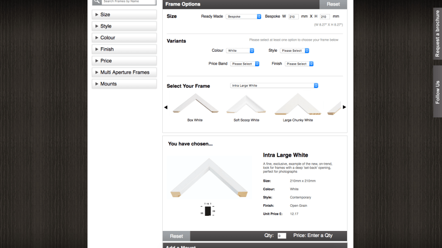
FRAMING:
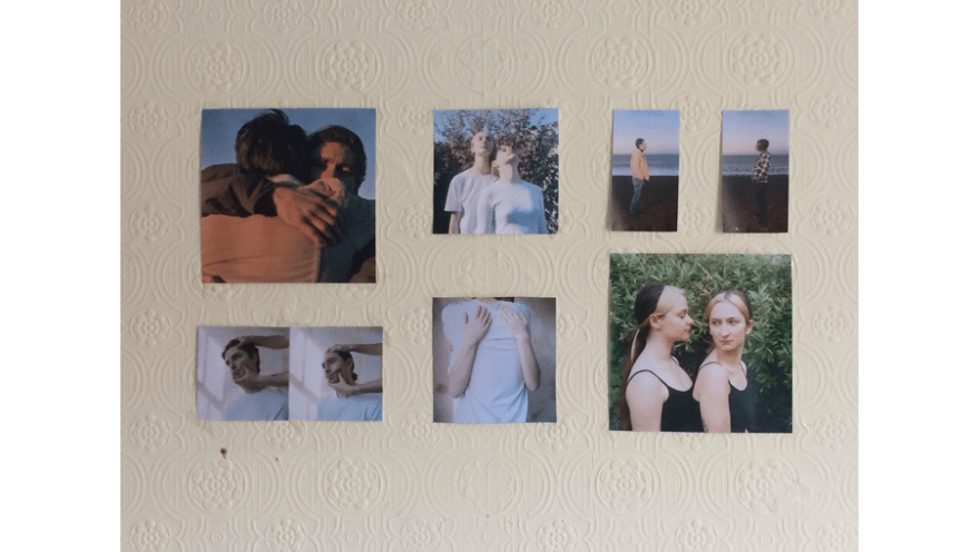
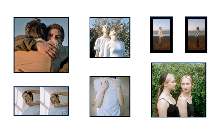
IMAGE CHANGE:
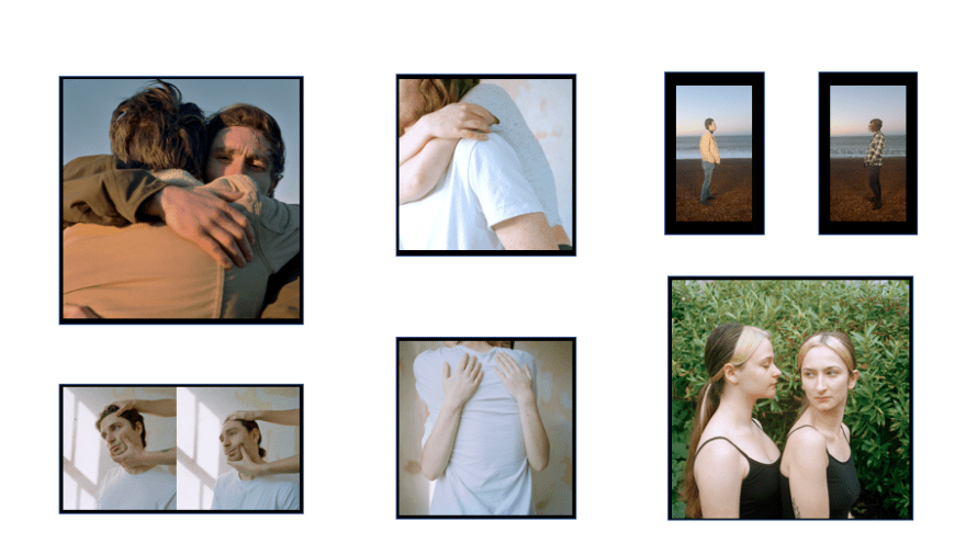
IMAGE CHANGE:
MOUNTING INSTEAD OF FRAMING:
WHITE FRAMES:
COLOURED FRAMES AND FEWER IMAGES:
BLACK FRAMES AND FEWER IMAGES:
EVALUATION AFTER SPEAKING WITH NICK:
Upon showing Nick my layout ideas and image combination he pointed out the rigid way in which I was presenting the work. I had blocked and measured everything out so that it fit into a perfect rectangle or square, and was visually symmetrical or as close to symmetrical as I could get it. I didn’t think much about this layout as being problematic, probably because it came naturally and I felt I wanted as much control of the work as possible. However Nick pointed out that the nature of the work is that it is in a way, unresolved, more natural, and more fluid, an exploration of the theme as appose to a rigid answer to the issues I have been exploring.
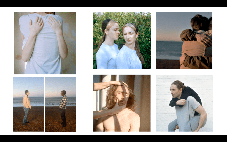
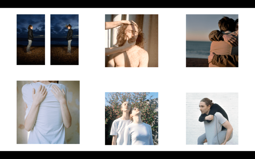
Nick also made a comment on the top right image, of Rowan and Jack embracing, he was unsure as to how that image made a reoccurrence. However I felt that I had not separated that work from the more recent work, those photographs were very key in the journey to my current images and I felt that they were visually strong enough to be a part of my final edit. Moreover, they contain the awkward physical contact that the other images also have, and with this theme being key in the progression of my work and the realisation of my final edit I thought it worked well with the other images. I also felt that while Rowan was looking at the camera, he is not uncovered enough for it to be too invasive and differ too much from the images where people are looking away. I feel that in the most recent edit with the moving image, the two large prints and the diptic, there are combinations of us looking at each other, looking away from everything, and engaging with the viewer, multiple perspectives.
I also feel that the colours worth with each other as the settings and locations are neutral enough to not overtake the photographs and become the focus, but are interesting enough to keep the images engaging, each location with its own back story as to why it was used.
The following are some more loose hang inspirations, some emailed over by John House in preparation for possible framing and hanging techniques. Some of the work is by established photographers and some is work of past students.
 -Photographer Yann Gross. Note the mix of colour, B&W, frames and non-framed, overlapping, sizes etc. It is actually quite simple but very attention grabbing and creative.
 -Bella who graduated last year went to a jazz hang and also introduced plants into her space which worked with her aesthetic and style.
 Tom Roche – also graduated last year and went to town with his jazz hang – some images overlapped, some framed and some not. He had a very cleat vision which was brilliantly executed, but this style can easily go wrong if not given proper due care and attention.
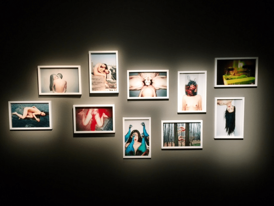
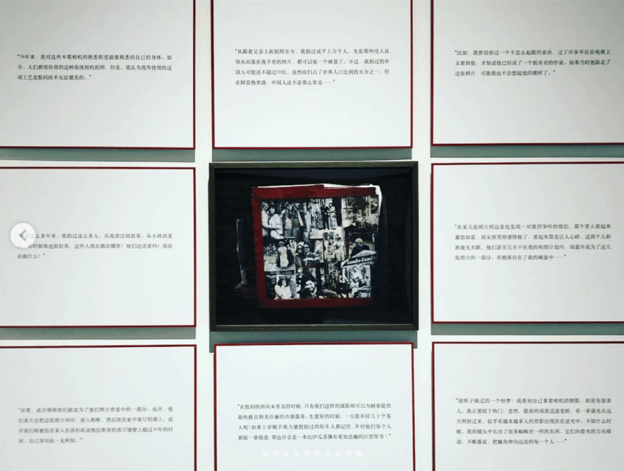
Ren Hang is one of my favourite photographers, and exhibited his work in this way in Stockholm in 2017, an article about the show explains the work briefly.
“There are several other exhibitions going on simultaneously. Of special note is exhibition of the work of young Chinese photographer Ren Hang, entitled “Human Love”. Due to his use of nudity and images of sexual liberation, he has been a controversial artist with the Chinese government often encountering censorship. Sadly, Hang passed away last week at the age of 30, apparently by committing suicide. This, of course, makes this exhibition all the more poignant. “Human Love” runs until April 2nd. Ren Hang”
Ren Hang often showed work in this way, using light and space around the photographs to emphasise the unusual nature of the images. These are very interesting as they are shown in the dark, with little light on them directly.
The following are some experimentations with more loose jazz hangs for exhibition:
1.
2.
For this layout I have been very inspired by the work of Yann Gross and the way in which they overlaid prints, as well as having a combination of framed and non-frames prints, that could be printed onto stickers that go onto the wall directly. I also need to consider the moving image, as this is presented on screens and therefore there would be three different ways of showing the work, in frames, as stickers and on a screen. Perhaps this way of presenting feels more like the way thought work, the way that thoughts are not organised and can take many different forms. It also represents the differences between myself and my siblings, the different forms we take ourselves, the way in which we interact with each other being different, the fluctuations in our relationships and the way in which we are all different sides of the same coin.
3.
In this example I have added the print of myself and my sister on the left, unframed and stuck on the wall like the two larger prints. I feel like this image also embodies the awkward physical contact between myself and my siblings, as well as including my younger sister and myself more. I felt that the previous edit was very much about the two boys, as they were in most of the images and the moving image, however this edit brings myself and my sister into the work more. The image also has visual similarities to the photograph of Rowan and Jack hugging, and I like this connection, yet separation, as the boys embrace, and the girls embrace, but separately. Then the image of the arms hugging the body is the image that breaks that separation, me and Rowan share an embrace and break the male and female divide in the work. I feel that these images are an important representation of my connection with my siblings, and perhaps need to emphasise this in the layout.
4.
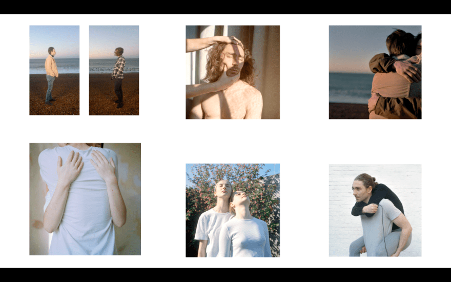
For the following edit I have now included the triptic of myself, Rowan and Jack sitting on chairs. I have decided to show these images in frames to give them more structure and stature as they are such small prints. I feel that they don’t need to be large, as they are repeats I feel that they’re theme is so clear that they can be quite understated in the context of the other photographs. I almost feel as if the viewer will take these images in subconsciously, themes of identity, emulation and rejection I feel are clear in these images, and they will set the tone for when the viewer is to scan the rest of the photographs. 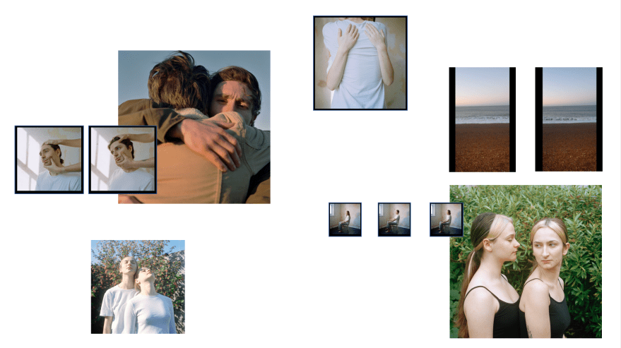
5.
For this edit I decided to swap the bottom left photograph of myself and Flo with a singular image of Flo. I was interested as to what the work would look like if I isolated her into an image of her on her own. She is my half sister and therefore I have less biological relation to her compared to my brothers, perhaps this separation I have with her would be an interesting this to highlight. Despite this separation we have a strong relationship, perhaps due to the differences we have we are both working harder to have a connection with each other. I feel as if she seams lonely by isolating her singular portrait like this, which is perhaps a correct response to have, however this theme does feel like the start of a new project.
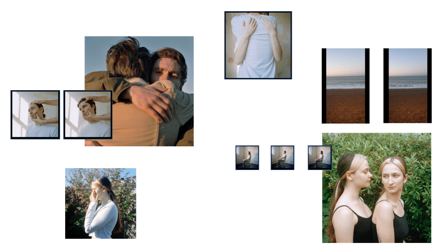
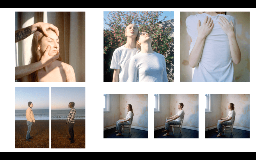
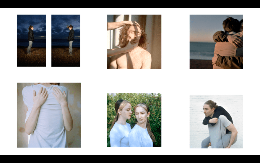
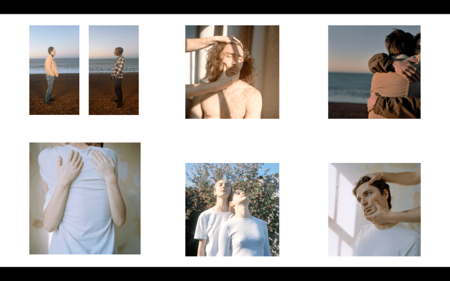
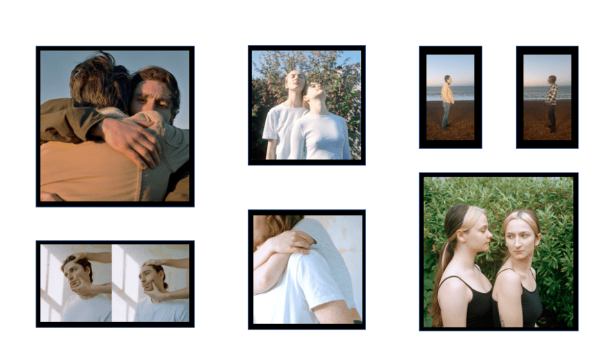
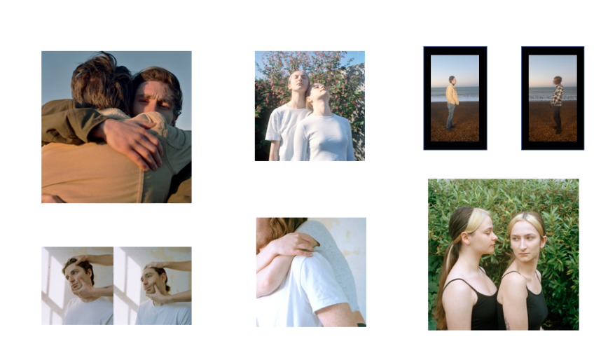
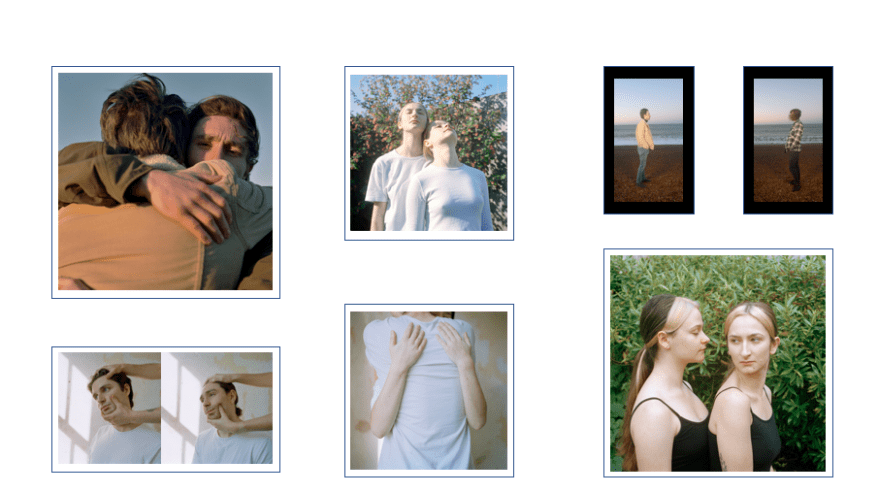
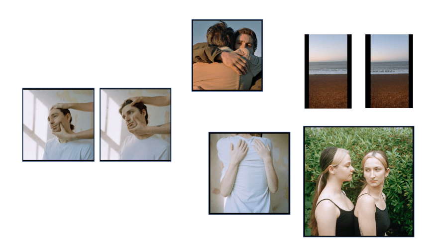
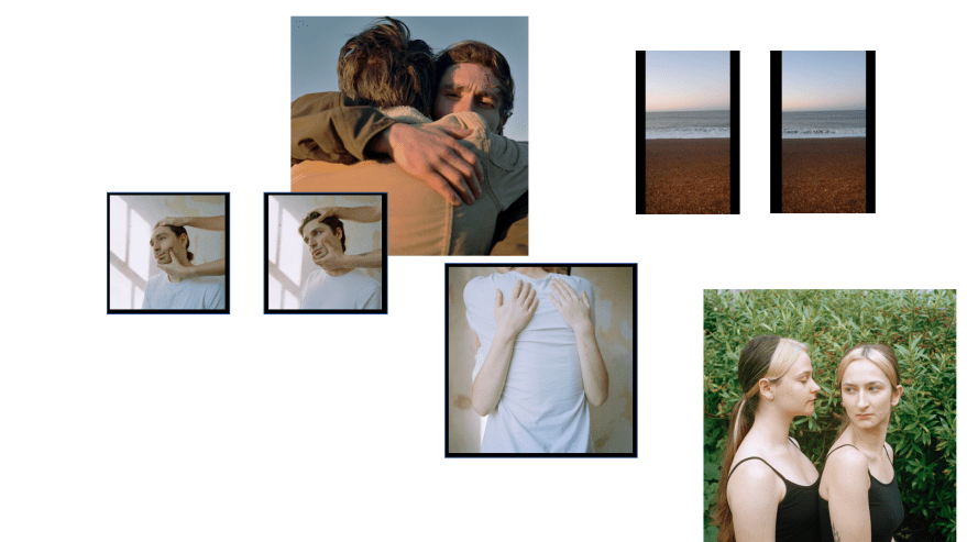
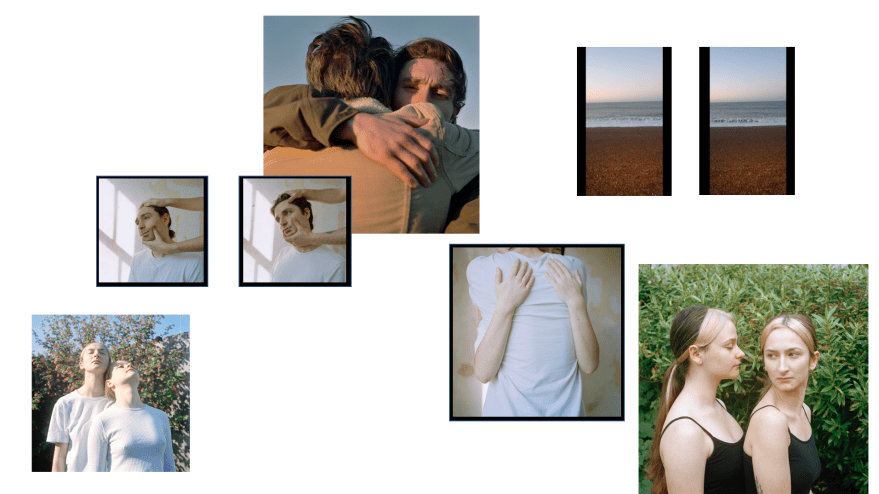
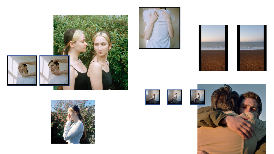
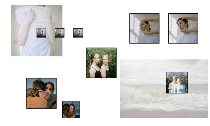
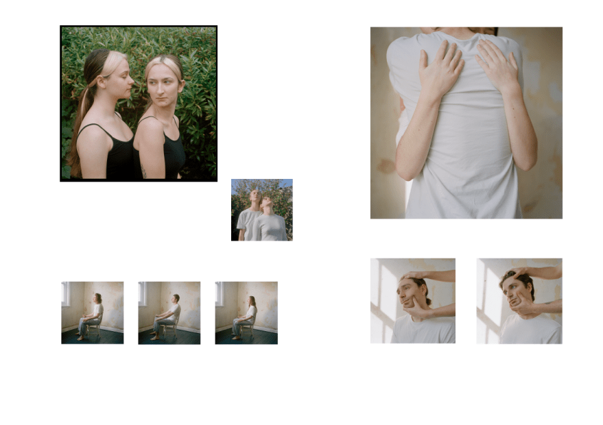
6. FAVOURITE SO FAR
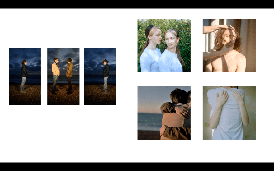
The following is currently my favourite edit and presentation for the body for work. I have included two monitors depicting a moving image that features Rowan and Jack, two large prints that are unframed, two medium prints, one framed and one not, one diptic – framed, and one triptic – framed. I have included the moving image as I feel that the piece is very interesting in creating a tension through out the work. The two boys stare at each other from separate frames, not looking at each other but looking at each other at the same time, this connection yet not connection embodies the similarities between them, yet the way in which they still remain completely different. I also feel as if the piece creates an almost aggressive atmosphere, as if they are staring at each other before a fight.
The large print of myself and Flo is one of my favourites, it is filmic and has a lot of narrative, there are themes of control and jealousy between us. I have presented this print unframed as I feel the colour and busy aspect of the image is overstated enough without being highlighted. The manor of the photograph purely with how it was made embodies control, I told her what to do, and she did exactly what she was told, the shooting process was very much like the image itself, with me looking back at her making sure she is doing what I want her to be doing. While our hair being the same says so much about the way in which our relationship works, I feel that our body language embodies a tension.
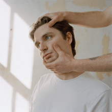
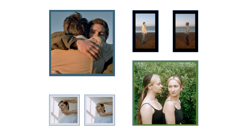
The second large image is also not framed, depicting Rowan and Jack embracing was one that I thought I had left behind, however I have realised that the feeling it creates is still relevant. It is not a comfortable hug, in my eyes. Nick has stated that because I am aware of the tension behind the image it has that meaning just to myself, however I feel that because Rowan is looking into the lens it has broken the fourth wall and makes Rowan seam detached from the hug. An emotional embrace would have the subjects close their eyes, smile, and usually push their face close to the other persons body. However in this hug Rowans face is a distance from Jacks shoulder, and tilted slightly away from his head to avoid them touching any more than they have to. I also like the lighting in this image, the warm tones and hard light on Rowans face has made him furrow his brow, adding to the images atmosphere.
The image at the top of the presentation of myself and Rowan hugging I feel ties in the two larger photographs. I have shown this medium sized print framed as I felt the pale colours would need to be separated from the wall. I have shown it half way between the two large prints. One large is of me and Flo, one large is of Rowan and Jack, then this image combines these subjects in an abstract embrace. The subjects of this image are not clear and the lighting is more subtle, as if the combination of the siblings is a sensitive subject. The image could equally be Flo and Jack, which is why I feel it is important, the arms and body are interchangeable for each of us.
For the next medium sizes image I have shown it unframed, so as to link with the larger photographs. I was interested as to what the work would look like if I isolated her into an image of her on her own. She is my half sister and therefore I have less biological relation to her compared to my brothers, perhaps this separation I have with her would be an interesting this to highlight. Despite this separation we have a strong relationship, perhaps due to the differences we have we are both working harder to have a connection with each other. I feel as if she seams lonely by isolating her singular portrait like this, which is perhaps a correct response to have, however this theme does feel like the start of a new project.
The two smaller images are a diptic, framed separately and presented overlaying the larger image of myself and Flo. I have decided to frame these pieces to give them some levitation from the wall due to their pale colours and to separate them from the image they lay on top of. The reason I have overlaid the images was that I was inspired by the presentation of Yann Gross and his use of layering the images on top of each other. I then thought about what this could do for my work, and how this might enhance the theme. I feel that it makes the images feel as if they are competing with each other to be seen, which is obviously a large part of the work. These are also some of my favourite images as they perfectly represent the theme of control, specifically of older siblings authority compared to the younger sibling. These images were purposefully more aggressive than the images of myself and Flo due to the gender difference.
For my final images I have shown a the smallest prints as a triptic, framed, half standing on their own and half overlaying the other large print. I feel that these three are some of the most important in the work, solidifying that idea of emulation and rejection, inspired by Prophecy Coles’ Sibling Relationships. I also feel like these three images placed in this way look like an ellipsis, as if the project is unfinished and there are so many more aspects of it.
RESPONSE TO THIS LAYOUT:
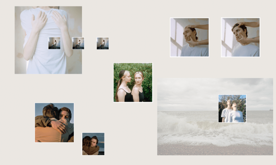
“For me, it’s too busy. The overlay ‘thing’ can feel a bit forced as a hanging strategy now; it can be a good way of treating very different forms of image -making in an installation (a la Gross using transfers as a way of positioning large monochrome landscape images alongside colour portraits) but I don’t think that you images are suitably different enough to warrant that format. Scale can be useful – such as with the smaller version of the three seated portraits – and you could consider changes to framing (warmer wooden frames for the ‘hug’ image of your brothers & maybe the image of you and your sister next to the bush against more neutral white frames for the more ‘controlled’ images). But I feel that the transfer would make for unnecessary ‘visual noise’ in a hang that already mixes still and moving imagery.” – Nick
“I agree with Nick. I just been looking at Photocaptionist Instagram this morning – they posted something from The Abode of Anemnesis that looked interesting. If you want to break yours up I think that something other than overlaying is the way forward. You could try painting the wall a different colour or use different frames.” – Jim
REFLECTION:
I feel that the way in which the layout was coming together was interesting, different, and a way to show the range in the work by showing it in a range of ways, however I do understand what Nick means, in terms of making it too busy. Perhaps the overlaying is too much but the way in which I have changed the scale and spacing of the images would be a good idea. I will look into the layout option Jim suggests as I feel that there will be another interesting way in which to hang the prints.
I do however still really like the use of the overlapping of the images, particularly the very small prints in the triptic as I feel they look almost like a thought bubble.
I am going to do further experimentations of scale, overlay, no overlay and frame to see if there is a way I can use interesting techniques but also make the presentation relevant to the work.
The Abode of Anamnesis – Photocaptionist Instagram
This page was recommended by Jim and had a post with many interesting exhibition presentation examples.
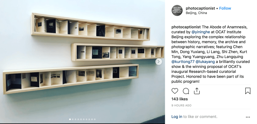
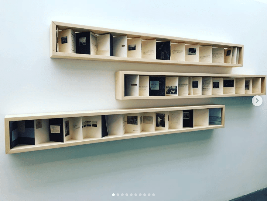
I am very interested by presentation example bellow, I feel that it is very clean and clear while being interesting. However I am not sure how well this would work with my images as the example contains what looks like found photographs and my prints would need to be larger.
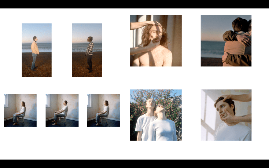
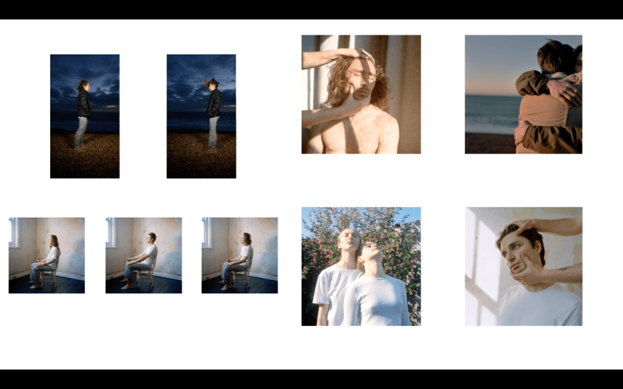
FURTHER EXPERIMENTATION:
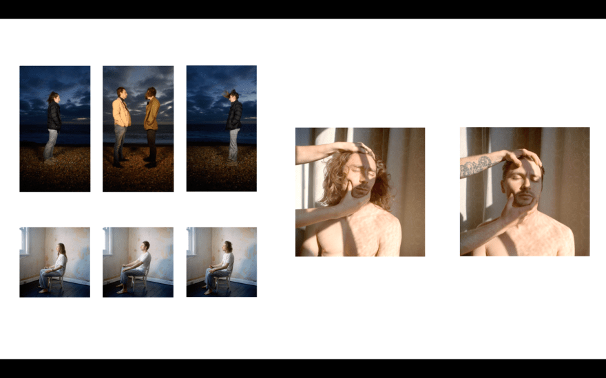
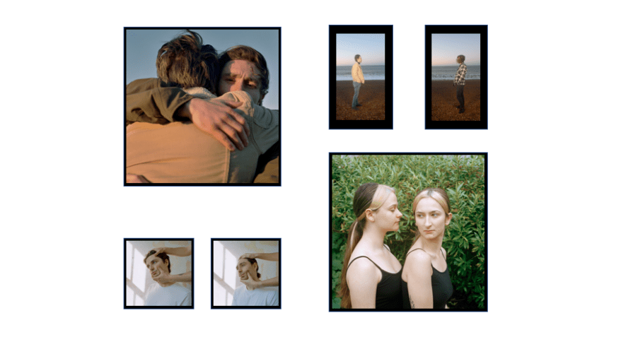
BLACK FRAMES:
(Without Moving Image)
WHITE FRAMES:
(Without Moving Image)
(Preferred of the two)
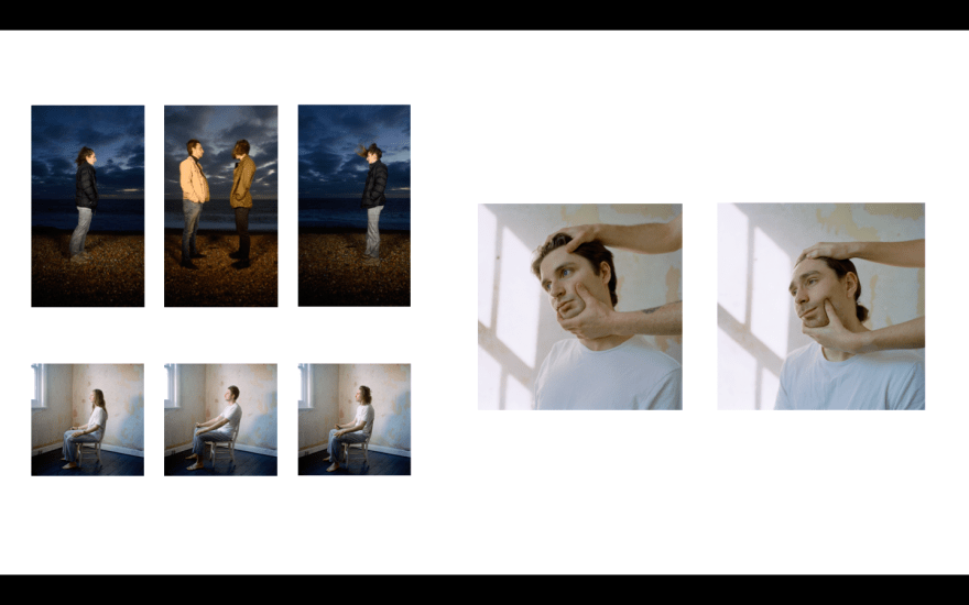
WITHOUT WATER/ FULL OPACITY ON EMBRACE/ WHITE FRAMES:
(Without Moving Image)
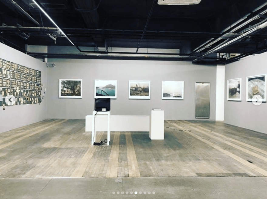
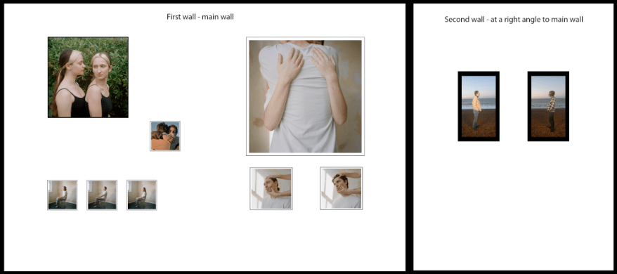
FINAL PRESENTATION MOCK UP:
FINAL PRESENTATION MOCK PRINT (REAL SIZE MOCK UP):
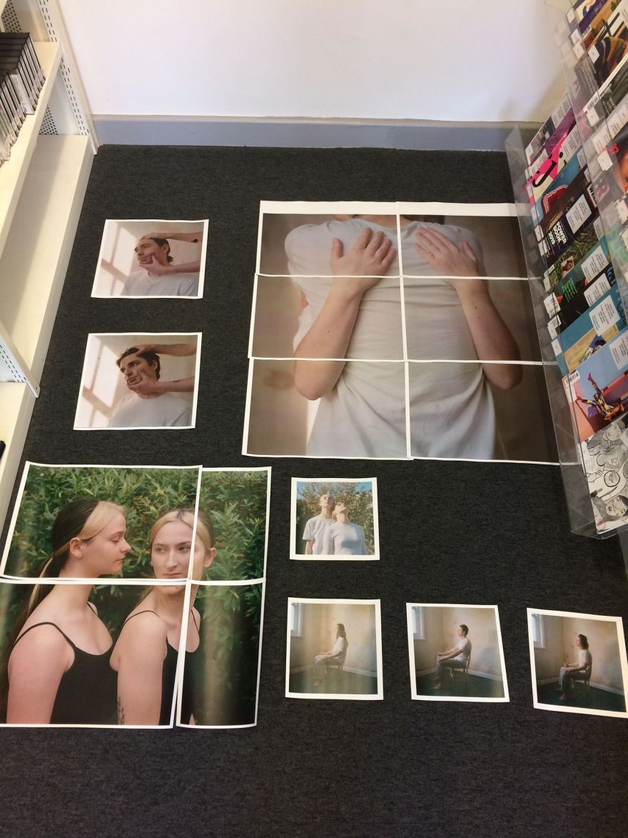
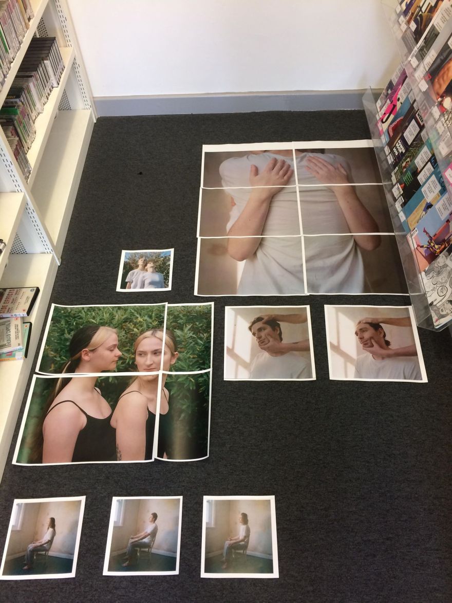
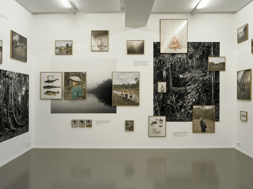
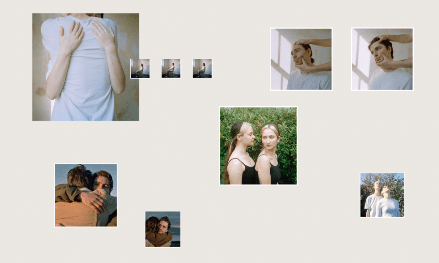
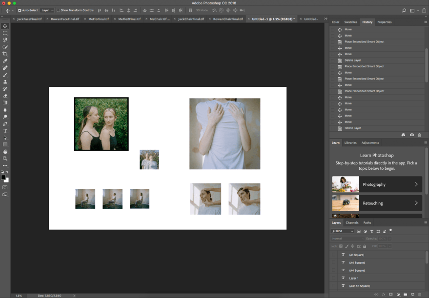
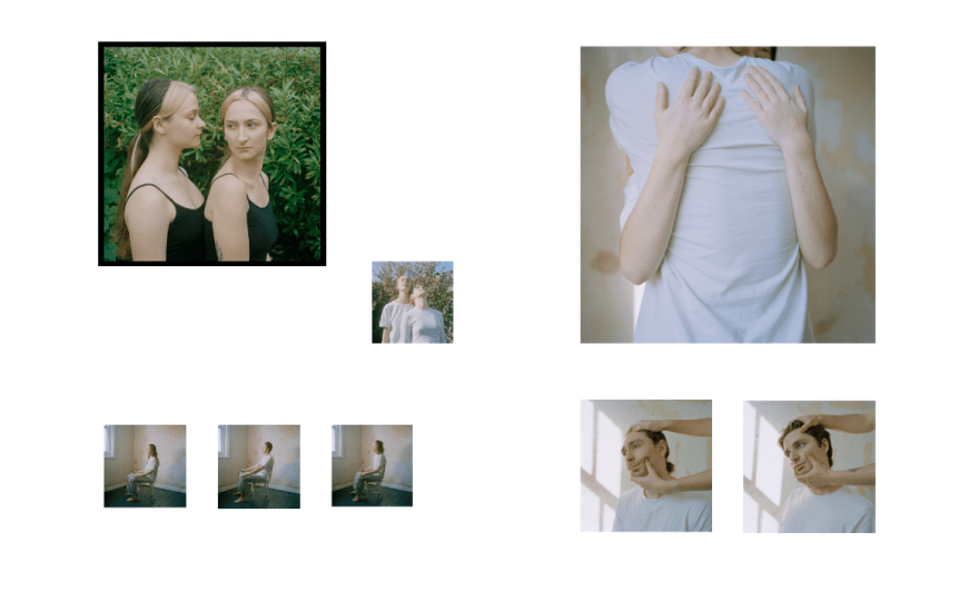
For my final layout I decided to refine the images I was presenting on the wall. The largest print is an A0 square size, and the smallest is just under A4 square size.
FINAL LAYOUT (PHOTOGRAPHS):
These are all my images, in their final layout presentation after being post produced and colour corrected.
ANOTHER THOUGHT…
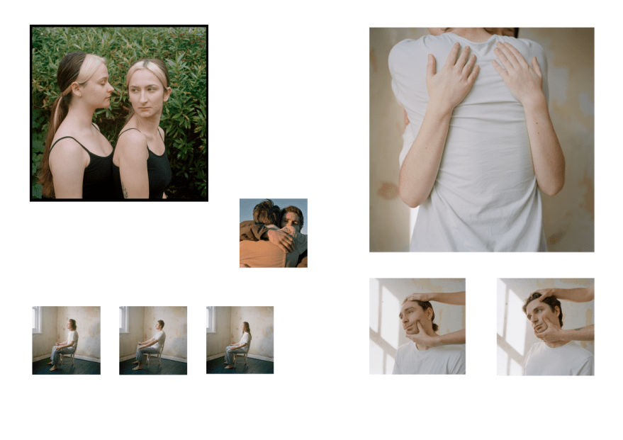
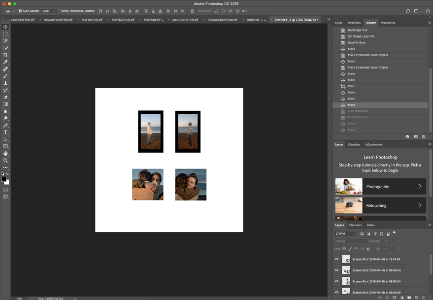
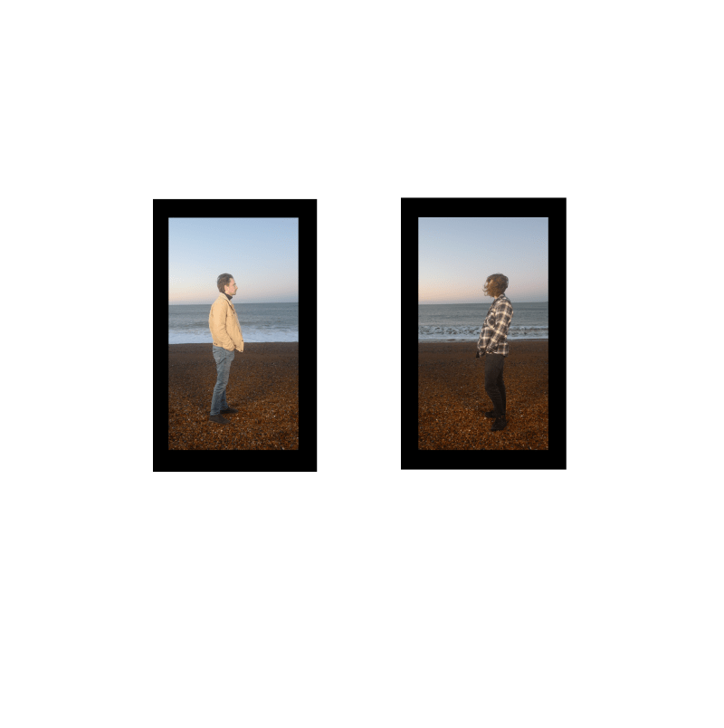
While finalising my layout ideas, was looking at my images of the boys on the beach and comparing them to my final images, and I felt that there were stronger images in the beach portraits, that were still in keeping with the rest of the final images. I have decided to swap the middle photograph of myself and Flo with this portrait of rowan and Jack. I feel like the beach portrait gives more context between rowan and jack, is a little more focused on Rowan, which I like because of the nature of the projects development. I also feel that the colours bring out the colours in the rest of the work as the other image of myself and Flo was a bit diluted and I feel the work needed a strong colour. Moreover this small portrait will bring together the moving image and the imagery and give the beach setting a little more context.
At first I included that second portrait of my sister as I felt she wasn’t in the project enough, however on second thought, the large portrait of her is the second largest portrait, the most colourful and the image that also features me the most. It is also the only image (including my moving image) that includes two faces, mine and hers. I feel that this shows her importance in the work, and therefore I do not need to feature her twice for this reason.
